Designing a digital companion for a physical space
How a shopping mall app was designed to support real-world behaviour, connect physical actions to digital value, and scale through systems.


Context
The NorteShopping App was designed to operate in a challenging territory:
a digital product whose value depends almost entirely on physical behaviour.
Users enter the mall, move around, shop, solve things in the space — and leave.
Historically, the relationship ends there.
From a business perspective, this results in limited continuity, little visibility into real behaviour, and a constant reliance on short-term campaigns to generate return.
The app emerged as an attempt to extend that relationship over time, not by competing with the physical experience, but by supporting it before, during, and after the visit.
My role
I worked as a Product Designer with a focus on systemic thinking and end-to-end experience, involved from the discovery phase through to defining product structures designed to scale.
Beyond design delivery, I acted as a synthesis point between research, product, and business, helping turn fragmented inputs into clear decisions — such as defining Ganha as the core value system, establishing a single structural pattern for in-app services, and positioning the home as an orientation anchor rather than a promotional showcase.
The goal was not to optimise an isolated feature, but to organise product decisions into a coherent system, sustainable over time.
Discovery
User research insights
Research confirmed that the app is not perceived as something to “browse”, but as a support tool during the visit.
Three patterns consistently emerged:
The app is opened with clear intent, usually already inside the mall
Value lies in solving something quickly, not in discovering content
Loyalty only makes sense when it is simple and visibly tied to real behaviour
These patterns translated into recurring user stories such as:
As a visitor, I want to quickly decide where to go or what to do without wasting time.
As a frequent customer, I want my purchases to count without having to understand complex rules.
As an occasional user, I expect the app to work even if I don’t use it regularly.
As a visitor, I return to the app when it helps me save time or avoid physical friction.
These insights made it clear that clarity, predictability, and resolvability were more valuable than functional depth or prolonged exploration.


Benchmark: competitive context
Rather than comparing isolated features, the benchmark focused on the role each product plays in the user journey.
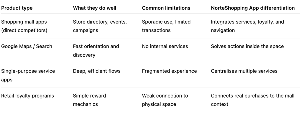
This framing helped avoid defensive decisions, making it clear where the product should invest energy — and where it should not compete.
Here's my resumé